After several months of anticipation and a slew of developer and public betas, the thirteenth iteration of iOS saw its public release on September 19, 2019. With it came some long-awaited updates to HomeKit. Well, let’s just say Apple’s Home app. I say this as the features flagship HomeKit updates announced at WWDC19 are still in the incubator. Nevertheless, there have been some significant changes to Apple’s Home app that are worth taking a look at and in this article we’ll focus on the most drastic top-level changes and I’ll give you my impressions of it along the way.
Navigation
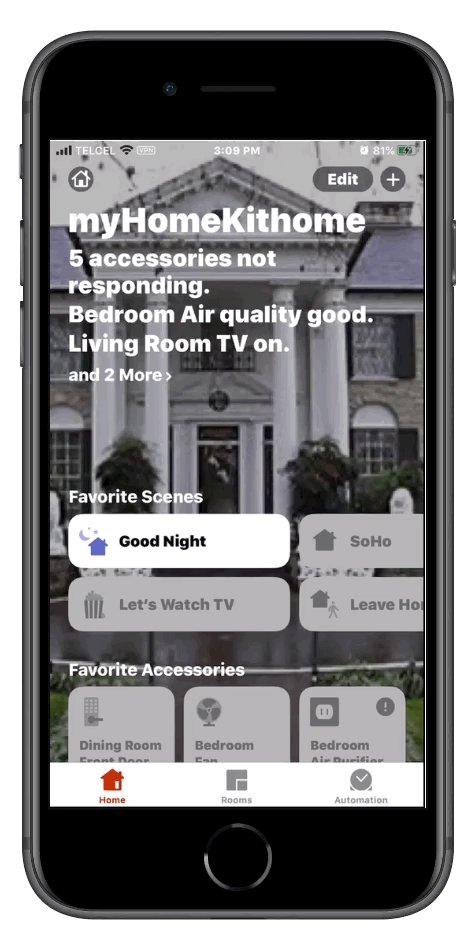
Perhaps one of the most noticeable changes to the Home app is navigation. We can still tap the “back” button at the top left to reverse one level through menus, but now we can leave the entire menu by swiping down from the top of the menu. While this might seem like a small change, I’ve personally found it a little annoying especially when adjusting up/down sliders for actions such as brightness and humidity levels as it often throws me out of this control menu altogether. Left and right navigation is just fine.
Hubs & Bridges
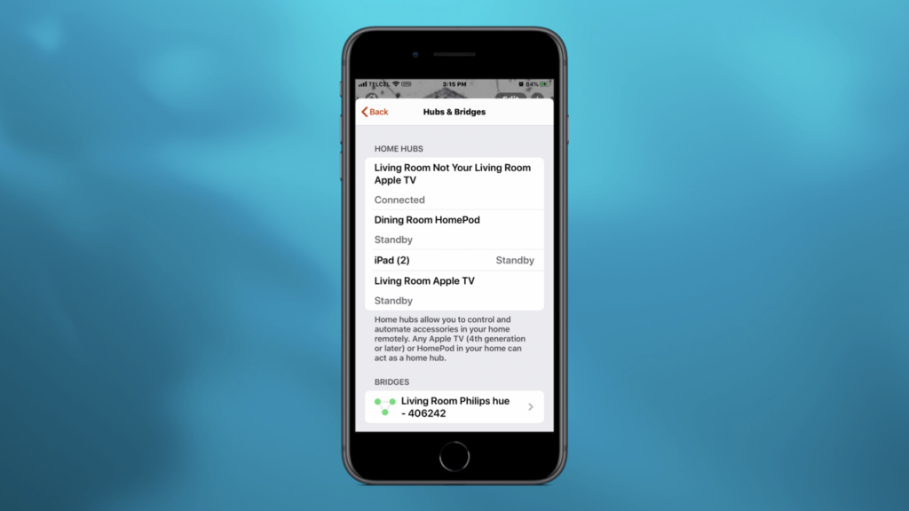
In our home’s settings, we may noticed that the order of some functions has been adjusted namely our Home hubs. In fact, they have now been grouped together with any HomeKit bridges that we may have such as the Lutron Caseta or Wemo bridges and although we still assign these bridges to a room in HomeKit, they will not appear in that room as a tile in Apple’s Home app. I personally think this is should have been the case from the beginning as the only action that we can take with bridges is removing them from from our Home data.
Default Wallpapers
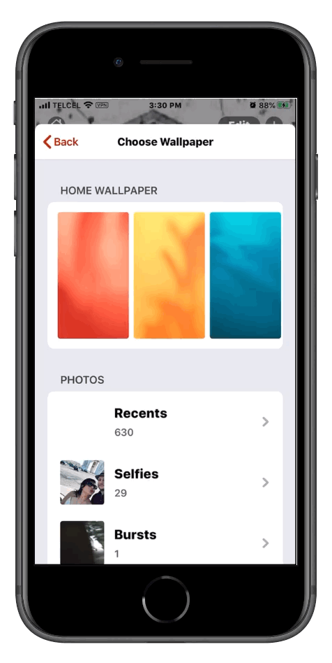
In iOS 12, Apple did away with the skeuomorphic wallpaper designs replacing them with more solid orange, blue, and green ones. This time around, we’ve gotten 6 more options that bring a bit more life to the stock images if photos aren’t your thing.
Final Thoughts
My initial impressions, at least from a top-level perspective, is that the changes are more of “Well, we have to change something.” Rather than “This is improve the user experience.” The new Home app definitely feels more modern and looks and feels more like the other stock iOS apps, but at least in 13.0, not a lot has changed…. In the Home tab anyway.
What changes would you have brought to the Home tab? Did I miss any big changes? Let us know in the comments. Don’t forget to follow us on Facebook, Twitter, and Instagram where we regularly post more HomeKit news and content.
We use income-earning affiliate links.
We may receive a small commission on purchases made using links on this page at no extra cost to you.