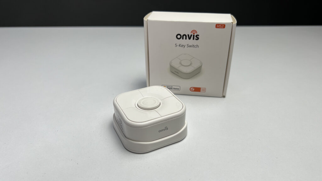
Smart buttons are a crucial part of a functional and practical Apple smart home. Not only do they give family members and guests something they are more used to,, they can give us HomeKiteers a ton of smart home control options and the Thread-connected Onvis 5-key Smart Switch offers up to 15 different actions, but is that too many options?
The Onvis HS2 is Simple yet Powerful
- 5-button smart button
- Single, double & long press actions
- Magnetic base with plastic mounting plate
- Thread / Bluetooth connectivity
- Includes device icon stickers
Before You Buy the Onvis Smart Button
- no Matter support
- Requires 1 CR2450 coin cell battery
- Operating temperature: -10º — 45º C (14º — 113º F)
- Operating humidity: 5 — 95% RH, non-condensing
- No IP rating
Better with Thread
On paper, there are two things that stand out to me about the HS2: Thread connectivity and its 5 buttons. At this point, Thread is poised to envelop my Apple Home and I’m happy to continue to expand that network. The HS2 functions as a sleepy end node device which means it can send and receive messages and does not pass along messages to other Thread devices, but this is by no means a negative.
If you don’t already have a Thread network, to get started you’ll need a Thread border router like a HomePod or Apple TV but once you have one of these devices in your Apple Home, the HS2 will automatically add itself to your Thread network without you. Having to do anything outside of adding it to your Apple Home.
The strongest benefit of Thread though is that it’s lightning fast, ultra-reliable, and low energy. The latter meaning that you can expect at least a year before having to change the batteries of this smart button. I’ve had mine for more than 8 months and my Home app is reporting that I still have 23% juice. Thankfully, the HS2 uses a single CR2450 battery which is pretty common and I have a ton of sensors and buttons strewn about the house that use it, so I can buy these things in bulk.
The HS2 Has SO Many Buttons!
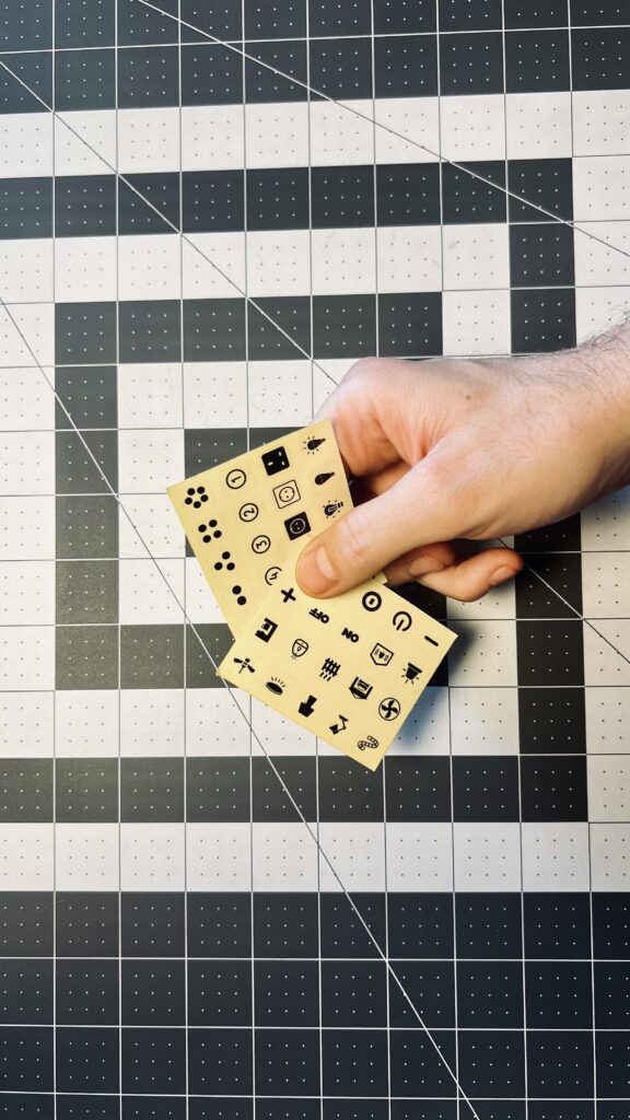
This smart button currently holds the record for having the largest number of actions for a Thread over HomeKit button coming in at a whopping 15. This means you can map loads of HomeKit accessory actions and scenes to this button for extensive control. It also means that you’ll probably find yourself forgetting all of those different actions if you are anything like me. Onvis apparently had some foresight here and included a few glow-in-the-dark stickers to help you and your loved ones identify which button does what. Nice!
I mentioned that the HS2 is leading the pack in terms of programmable HomeKit buttons with Thread, but it’s also a leader in the chunkiest HomeKit button race with, as far as I know, only Nanoleaf beating them out with their Canvas tiles being able to be used as HomeKit buttons.
So it’s really not that big in terms of volume, but its form factor definitely gives you the impression that it is larger than it really is. Part of this impression also has to do with where you plan to mount it.
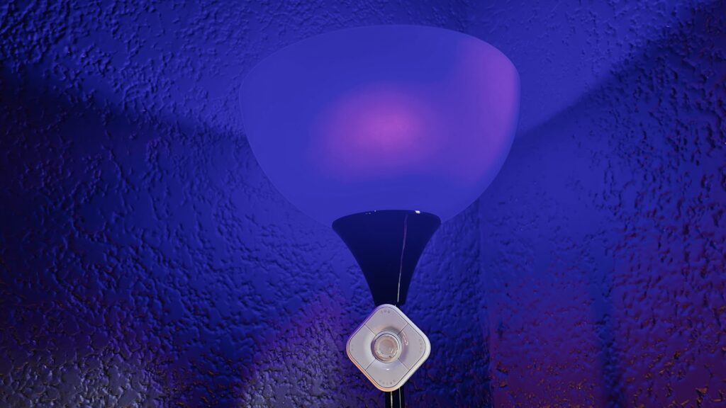
I personally cannot see it having a permanent placement on a wall. It just sticks out too much and draws unneeded attention to itself. I think it would be fantastic on a kitchen island or breakfast bar.
The good news is that it attaches magnetically to its base, or any other magnetic surface for that matter, and can be moved to wherever it is needed. While this is convenient and I have a number of these multi-button switches scattered throughout the house, I haven’t once actually removed them from their magnetic cradle to use them elsewhere. I just haven’t found it necessary. Maybe I’m just afraid I’ll end up losing it. It’s also worth noting that the magnetic cradle can be mounted using the included double-sided tape, of which there is even a replacement, or more permanently affixed using the included screw and/or masonry anchor.
Finally, the configuration and layout of the buttons is worth a breath. The face of the half-cube lays out four buttons in a quadrant with a single similarly sized round button protruding from the middle. It’s definitely not a design you see everyday, but I can’t help but think it could’ve been more attractive with a more conventional rectangular aesthetic.
As a last comment, I appreciate the audible and tactile feedback from he buttons. They are not the clickiest I’ve come across, but you can definitely hear and feel that you have pressed each button and it is a far sight better than having gone with a capacitive touch screen.
Do You REALLY Need the Onvis Home app?
I own a number of Onvis’ gadgets and therefore keep their app installed for quick firmware updates and when I feel the need to paint with the Kameleon RGBIC light strip, but outside of that, I do not find it particularly useful and its definitely not the friendliest of apps for blind folk. When it came to the the smart button, it does do one thing that no other app can do for it, firmware updates.
In the device’s settings, we can see some of information concerning its Thread connectivity including its current transport status, Bluetooth or Thread, its role in the Thread network, its capabilities in that network, and finally its sleep interval. While this information is largely useless since we cannot actually change any of the parameters, its a nice confirmation that we’re connected over Thread. It would be more useful to see all of the devices in our Thread network, but thankfully we have the Eve app which gives us a broader overview.
We are supposed to get access to a records list, but I can’t tell you what information is in that list since my app doesn’t show any events having occurred in the last 8 months I’ve been testing it.
These points in mind, you likely won’t be opening the Onvis Home app all that often, especially since you can assign all the actions right in Apple’s Home app.
You’ll no doubt notice when opening the switch’s settings that each of the 5 buttons are labeled as dots with single, double, and long press actions available for each. This may be a little confusing, but the round physical button is Dot 1 with the subsequent buttons continuing clockwise sequentially starting at the top left.
Other than the programming of the buttons themselves, the only other useful information that we get is the current battery status and firmware of the device.
How Accessible is this HomeKit Button?
I mentioned earlier that I appreciate the audible and tactile responsiveness of the physical buttons and I do. They are quite clicky which confirms you pressed each button the intended amount of times. This being said, they do feel a bit loose and weak. Not a deal-breaker, but something to be aware of.
As a blind individual, something else to be aware of is the lack of tactile indicators to let you know which button you are pressing. I actually had to go through and assigned different actions to each button in order to figure out which button corresponds to which Dot in Apple Home. I’ll save you the trouble and tell you that Dot 1 is the round button in the middle. To orient the button properly, the two QR codes should be on the left and right and you should feel a slight indention in the bottom side. Once oriented correctly, the 2 Dots button is at the top left with the other 3 following clockwise. This is a perfect place to use some bump dots or some other sticker to help you identify each button. The included glow-in-the-dark stickers might work for you, but I had a hard time telling the different figures apart.
As is the case with most IoT devices, the HS2 does have an LED indicator with no audible alternative, but it is primarily used to give you status which is mostly obvious with the exception of pairing mode. This mode happens after first removing the plastic film preventing battery contact when you first set it up or after performing a factory reset by holding down buttons 1 and 2 at the same time for 15 seconds and then waiting about another 10 for pairing mode to initiate.
I have written fairly extensively about the accessibility issues I’ve found with VoiceOver in the Onvis Home app, so you can refer to my review of the CT3 Door & Window Sensor for more specific information. Suffice it to say that you may need a little sighted help to get through the initial setup screens, but it’s fairly accessible once you get going. Either way, outside of firmware updates, you there’s nothing to really write home about with it, especially if the HS2 is your only Onvis accessory.
Does This Smart Button Belong in Your Apple Home?
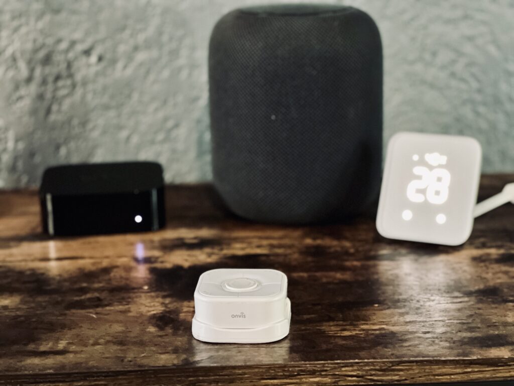
I was not at all a fan of the first HomeKit over Thread button to come out and though it is still part of my HomeKit home, I warmly welcome its replacement, but I don’t think the HS2 is it. This is not to say that it hasn’t found a firm place as a smart home controller for me, though. I use them in different ways with the HS2 taking its place on a table and the Wemo Stage Scene Controller being the primary controller for the master bedroom. I am the biggest proponent of physical smart home controls because presence, motion, and contact sensors don’t work for every occasion. The Onvis HS2 is an extremely capable programmable switch with the snappyness and reliability of Thread and the versatility of controlling up to 15 different accessories and scenes, even if I think it could use a design refresh. If I find myself needing to control a bunch of Apple Home stuff from a single place, the HS2 is absolutely an option I will consider. and the pribeing the primary controller
We use income-earning affiliate links.
We may receive a small commission on purchases made using links on this page at no extra cost to you.

