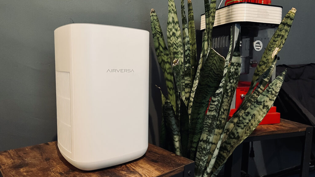
There is now quite a bit of competition when it comes to HomeKit air purifiers. They are by and large comparable in terms of their air-cleaning abilities, but all have features that set them apart from one another. The AirVersa Purel is staking its claim as the world’s first, and currently only, Thread-powered air purifier, but is it all it’s cracked up to be?
Features
- dual, 3-layer HEPA-13 filters
- Filters out contaminants down to 0.3 microns
- CADR: 221 sq. Meters per hour
- suitable for small to medium rooms up to 28 sq. Meters
- touch-sensitive display with adaptive brightness
- Built-in PM2.5 air quality sensor
Need to Knows
- Thread connectivity (requires HomePod mini or Apple TV 4K with Thread)
- replaceable filters last approx. 3,000 hours
- 23-53 dB noise output
- Dimensions: 8.66 x 8.66 x 13.58 in.
Pros
As I talked about in the intro, the Purel is the first and currently only smart air purifier to take advantage of Thread. This low-power, self-healing Wireless mesh protocol is fast, reliable, local, and doesn’t bog down your WiFi. It is also a full Thread router meaning that it helps to fortify and expand your Thread network sending, receiving, and routing messages to and from your Thread border router to other devices in the network. The best part is that you don’t have to bother yourself with any of this. Your Thread network automatically configures itself once you set up your accessories finding and creating the most efficient communication paths. Since it is a Thread device, though, you will need to have a Thread border router like a HomePod mini or Apple TV 4K with Thread if you do not have one already.
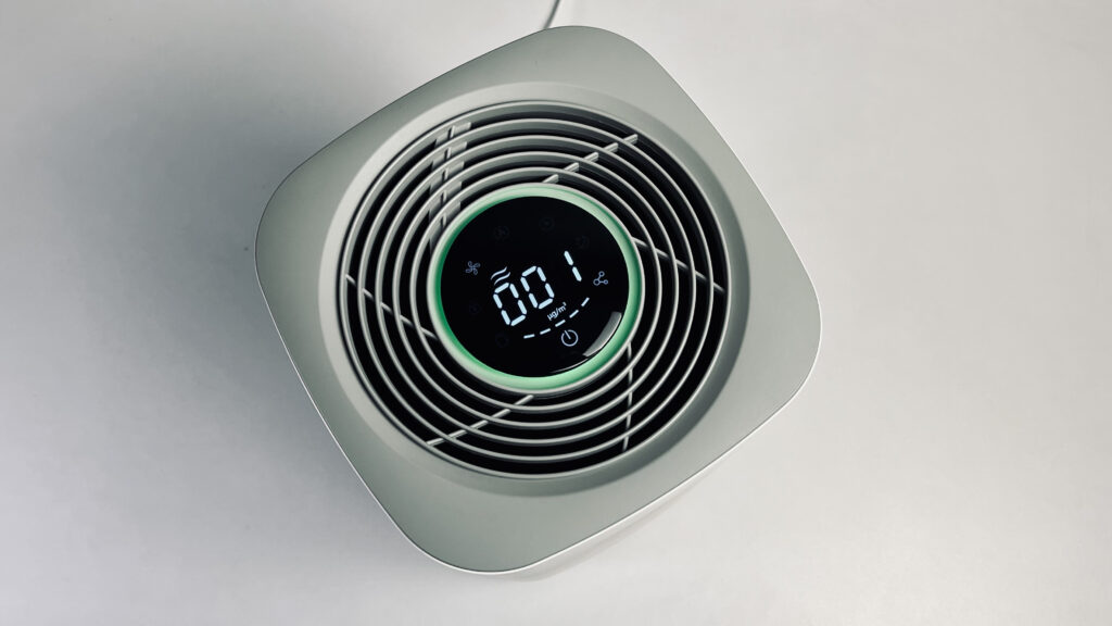
I debated at length about whether this was an actual benefit of the Purel, and you’ll see why below, but ultimately the touch display control panel is a winner since it does so much. At a glance, the LED display not only gives you a 5-level, color-based indicator of the air quality from green to red, it also gives you the specific PM2.5 density. It also shows you its filter life and connectivity status for quick reference. Being a touch display, it also gives you manual operation of power, fan speed, timers, sleep mode, and the child lock. This is an incredible amount of information and functionality in such a small package.
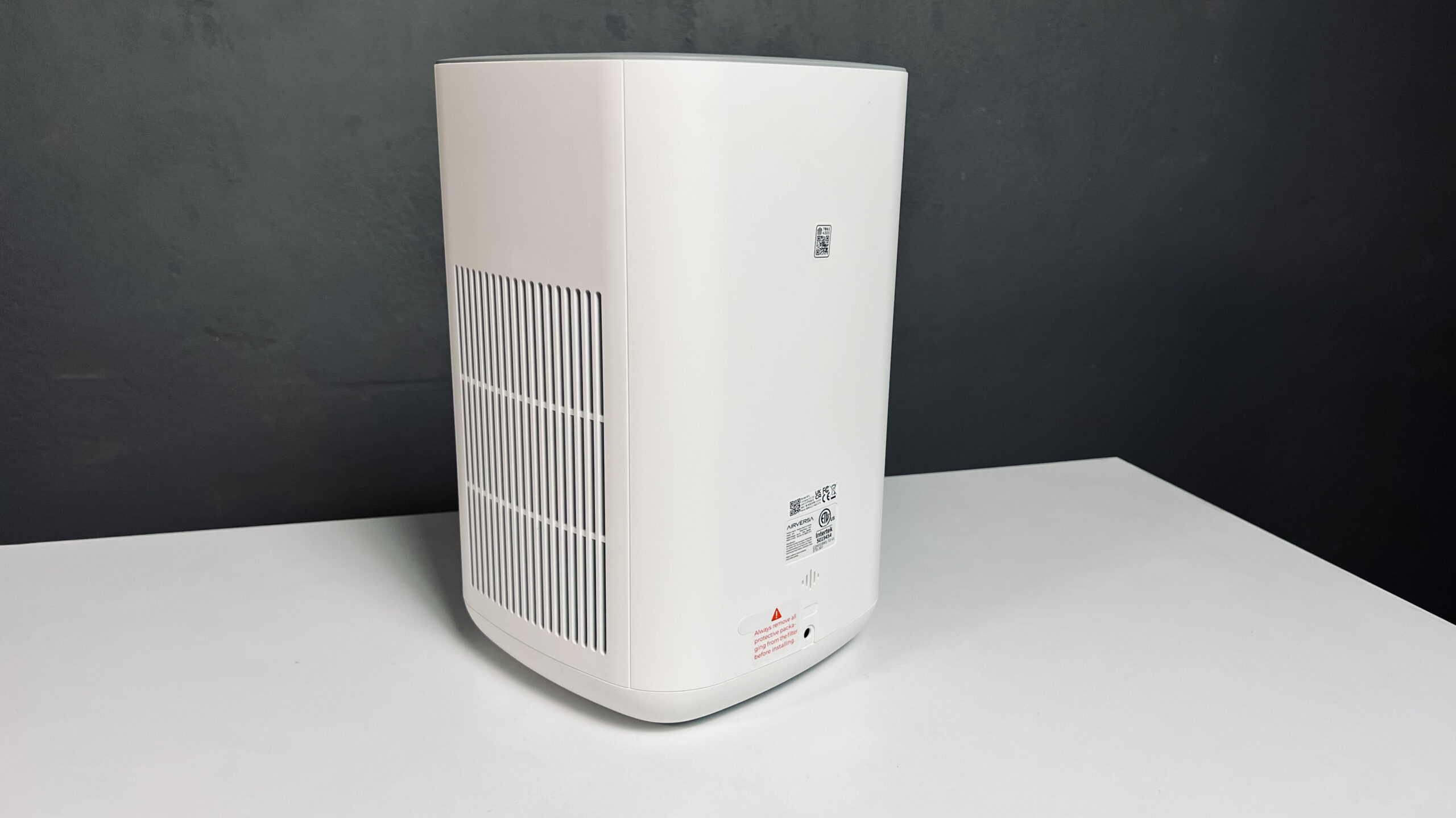
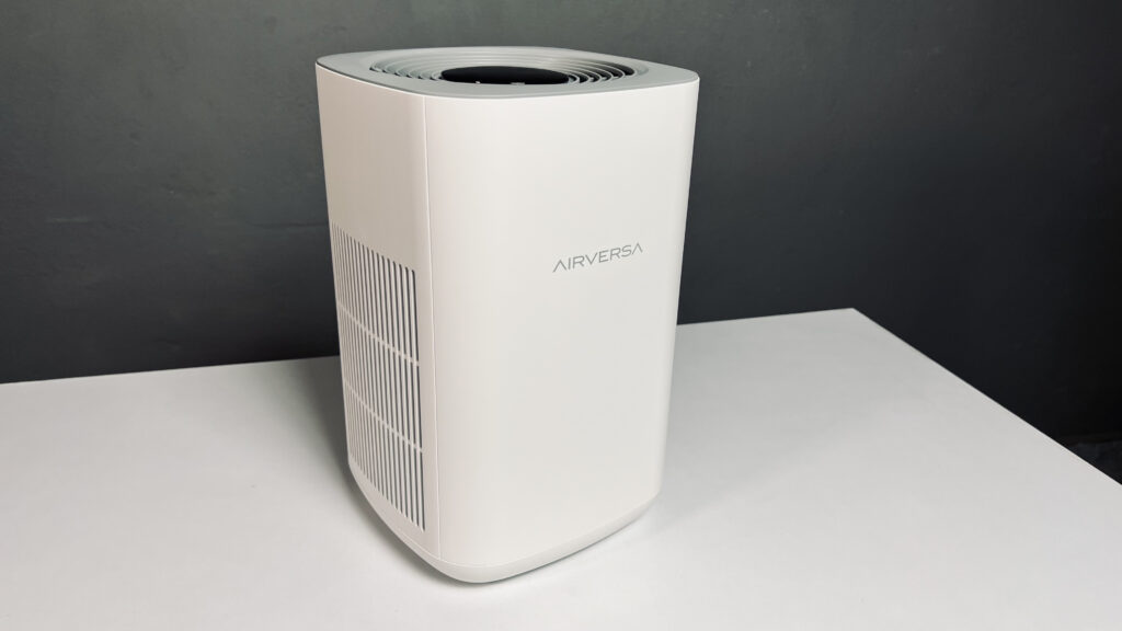
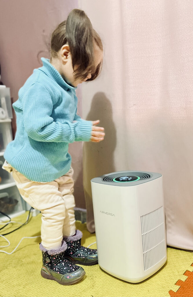
Speaking of small package, this air purifier is definitely on the compact side and this is a good thing. Being on the smaller side allows for flexibility in its placement and its minimal footprint and design aesthetic means it won’t stick out like a sore thumb in your home. Along these lines, this purifier is surprisingly quiet. Coming in at just 53 dB at the highest fan speed, it is noticeable, but not overwhelming and definitely quieter than the Sensibo Pure and VOCOlinc PureFlow which I also have in my home.
While the differences among smart air purifiers in Apple Home are not unnegligible, they do offer somewhat similar specs in terms of their purification properties. One area where they do differ is in their price and the offering from AirVersa is competitively priced. Often discounted, it currently goes for $170 in the U.S. There are less expensive purifiers, but they don’t have the feature set. Also, something you will want to consider is the price of the replacement filters which is something I definitely overlooked when first getting into air purifiers. Only setting you back $30 for the pair, the Purel’s filters are very reasonable.
Cons
The first HomeKit device from AirVersa, however, is not without its shortcomings. Of huge importance for me as a blind user is its accessibility and due to its touch display, it falls a bit short. I, of course, cannot knock this device for simply having an LED display, especially since all of the information displayed is accessible through any HomeKit app you prefer or just by asking Siri. Where I am slightly annoyed is with the touch controls. While they may look ultra-modern and seamless, they are an absolute disaster for a blind person. I am more than used to memorizing button layouts for all sorts of controls from remotes to appliances to ATMs, but when there is absolutely no tactile reference to locate a button, it renders a control useless. While I definitely prefer hard, clickable switches for controls, a solution for this oversight in accessibility is to include a recessed or raised line on either side of the touch control that would help, not just those with visual impairments, more easily identify a control.
The Purel has essentially 3 modes: manual, automatic, and sleep mode. However, if you, like me and more on this below, are primarily interacting with it in HomeKit you wouldn’t know as the sleep mode is only available through the Sleekpoint app or on the device itself. This may very well be a limitation of HomeKit since it is something that I’ve noticed in other HomeKit purifiers, but because of accessibility issues with both the hardware and software, this is a feature that I am completely unable to use as a blind guy.
The last area of improvement that I can see is regarding how it actually measures air quality. It uses a PM2.5 sensor to determine your room’s air quality. This is not a inferior indicator, but it only takes into account particulates down to 2.5 microns. I would have loved to have seen a TVOC sensor and maybe even a PM10 sensor to help more accurately reflect the air’s contaminant level and trigger the purifier. This being said, the addition of these two sensors would undoubtedly increase its price potentially making it less desirable.
The Apps

Although with auto mode engaged, I have found myself not needing to interact with the Purel at all, it’s nice to have a set of features that I’m able to integrate into my smart home.
In Apple’s Home app, two accessories are exposed: the purifier itself and its PM2.5 sensor. With the purifier, we can power it on and off and adjust the fan speed with it increasing or decreasing at about every 20%. Notably, we can toggle between manual and auto modes and we also have the ability to engage or disengage the child lock. Aside from this, something that isn’t so obvious is that we can check on the purifier’s filter status by asking Siri though it is not displayed in Apple’s Home app.
The PM2.5 sensor’s reading are presented in both a general air quality level and in the specific PM2.5 density.
In terms of automations, we can control the air cleaner’s power and fan speed as actions triggered by any number of programmable switches, accessory states, or sensor readings, including its built-in PM2.5 sensor which can be used to trigger not only the Purel, but any other HomeKit accessory.
The Sleekpoint app does all of this, but goes beyond the HomeKit experience allow you to automate sleep mode, toggle the adaptive brightness or the display, and even disable the audio feedback the purifier produces when changing modes or fan speeds. At least, this is what the user manual claims…
Accessibility
I ranted above about the hardware’s accessibility flaws, so I won’t bother repeating that here, but I need to also address some issues with the software.
While Apple’s Home allows for some solid interaction with the Purel in terms of controlling and automating it, the Sleekpoint app falls short with VoiceOver support.
The overall layout and navigation structure is standard and intuitive which is definitely appreciated. However, in order, the app’s toolbar tabs are unlabeled requiring me a screen reader user to have to enter into each tab and explore all of its contents in order to know what’s going on. It’s like having a organized file system with no folders being named.
Some of the purifier’s information like air quality readings is accessible in the Sleekpoint app, though none of the non-HomeKit controls like sleep mode, adaptive brightness, or audio feedback controls are labeled and therefore, largely unusable without a lot of frustrating tedious, and time-consuming trial and error.
The good news about these issues is that they can be easily solved with some fairly minor updates to the app. Improving an app’s accessibility not only affects users who require accessibility features, but also tend to create a more pleasant and intuitive UI experience for all users.
Final Thoughts
You may think that the negative points I’ve mentioned regarding accessibility would, at least for people with blindness, lead me not recommend the AirVersa Purel, but this is not the case. The benefits and features of the Purel far outweigh what it is lacking. First and foremost, it is a solid air purifier meeting if not exceeding what others in its class can do and at a generally lower price. As an IoT device, Thread provides a stable, responsive, and uncomplicated networking experience. Admittedly, I have a personal vendetta against touch-sensitive controls and this fact often draws me to smart devices because of their voice and app control. Thankfully, software issues are easily fixable and go far beyond catering to a small subset of users.
The AirVersa Purel is a very strong first outing for Sleekpoint Innovations. If they continue their dedication to providing a quality user experience and address the faults in the native app, I have no doubt that they will be a strong name in the HomeKit space for years to come.
We use income-earning affiliate links.
We may receive a small commission on purchases made using links on this page at no extra cost to you.
