In our last post, we touched on the over-arcing changes that came to Apple’s Home app in the thirteenth installment of iOS. While updates to the HomeKit framework itself are still in the pipeline, there have been many changes to the stock iOS Home app. This go-‘round, we’ll cover some of the more drastic and notable “updates” in the Rooms tab and I’ll provide some color commentary throughout our exploration.
Combine Tiles

Ok, ok, ok. We’ll start off with the change that has everyone up in arms and that’s how the latest version of the Home app is treating accessories with multiple HomeKit services. It is not at all uncommon for a HomeKit accessory to boast more than one service I.e. a temperature and a humidity sensor in the same physical accessory, a power strip with individually controllable outlets, or a humidifier with controls for both the humidifier and a lamp. Previously, these were displayed in the Home app as individual tiles with their appropriate information. Presumably in an effort to declutter our ever-growing smart homes, iOS 13 has combined the services into a single tile for each accessory simply displaying on the tile that there are multiple accessories. This presents an obvious problem with accessories such as power strips, but an even greater issue for accessories that give us information like environment data.
I’ve mentioned in the past that I wanted the ability to clean up my Home app combining redundant services in a room like temperature sensors, but the approach taken in iOS 13 really makes the Home app cumbersome and a burden to use. For accessories with multiple sensors, it would be easy enough to display the sensor data on the tile itself which addresses decluttering without removing functionality. In terms of devices such as fans with lights, power strips, and other devices with multiple services, they should have just been left as they were or at least give us the option to combine or separate them.
Combined Controls for Lighting Accessories

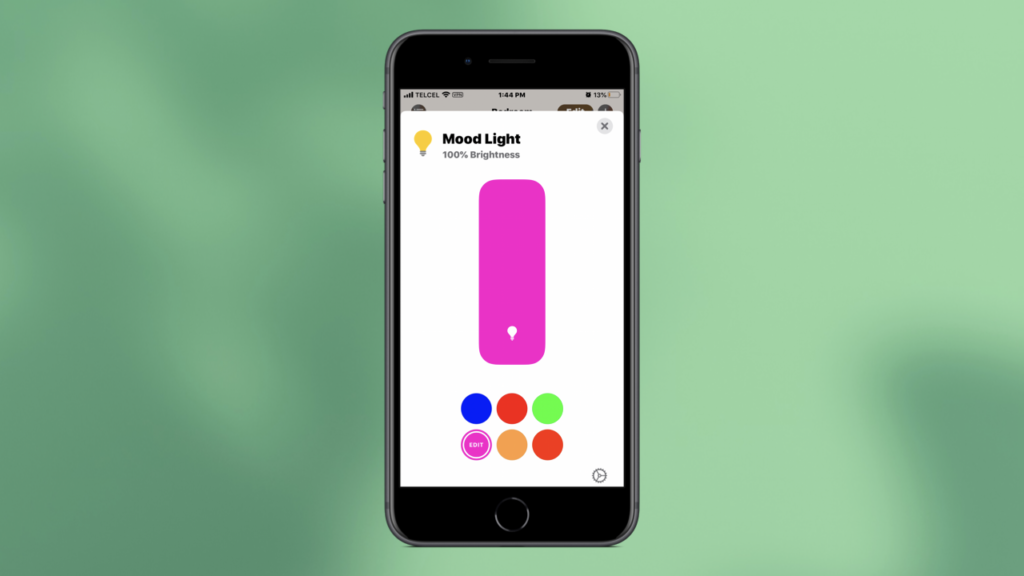
Continuing on the trend of combining, admittedly I really like how iOS 13’s Home app reorganizes the different controls for lights. Whether they full color, daylight, or just dimmable lighting products, all of the controls are now on one screen instead of having to jump back and forth through multiple screens. While I like this new layout, I have found that I have a tendency to swipe myself out of these controls because of the new navigation that I mentioned in our last post. This is a similar layout to accessories like televisions, but I’m not exactly sure why this wasn’t Brought to other accessories with multiple services like humidifiers or fans with lights.
Icons

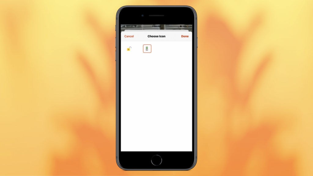
iOS 13.0 also brings us some updated icons and animations which are a little more representative of their accessories making it easier to recognize them at a glance. This really does bring some added life to the Home app, but I feel it is unfortunately overshadowed by the issue with consolidated services tiles. While we get some updated icons for some accessories, our library for scene icons remains unchanged. Finally, it is widely expected that in iOS 13.1, we’ll see an updated icon set for lights which is long, long overdue.
FInal Thoughts

For many Apple’s Home app is where they go to carry out their tasks for HomeKit and it’s generally a fine app, however the changes made in iOS 13 make it a little less fine and actually makes some third-party apps like Home 3 or the Eve for HomeKit app much more appealing for those looking for a bit more of a robust experience. I honestly rarely use Apple’s Home app except for more basic on-the-fly controls and iOS 13 makes it less functional for quick actions. As a parting note, one function of HomeKit in iOS that I do use every day is Home control in Control Center which looks just awful and I would no longer use it if it weren’t for muscle memory. The color scheme is difficult to distinguish and because of the low contrast, dimmed (off) accessories sort of become unrecognizable. What’s your take on “Tile-gate”? What are your ideas on how to improve it? Discuss in the comments! We regularly post more HomeKit-related on Facebook, Twitter, and Instagram so come hang out.
We use income-earning affiliate links.
We may receive a small commission on purchases made using links on this page at no extra cost to you.
