I have sort of sat on the sidelines and watched the initial Matter hype play
Whether you’re shopping for your favorite HomeKit aficionado or looking to stuff your own smart home stocking, these Black Friday HomeKit deals SHOULD NOT be missed!
I’ve come to realize that my journey in the smart home has a lot to
Late summer early fall is tech time and we’re used to seeing a bevy of
Amazon’s Prime Big Deal Days sees deep discounts in nearly all the online retailer’s departments.
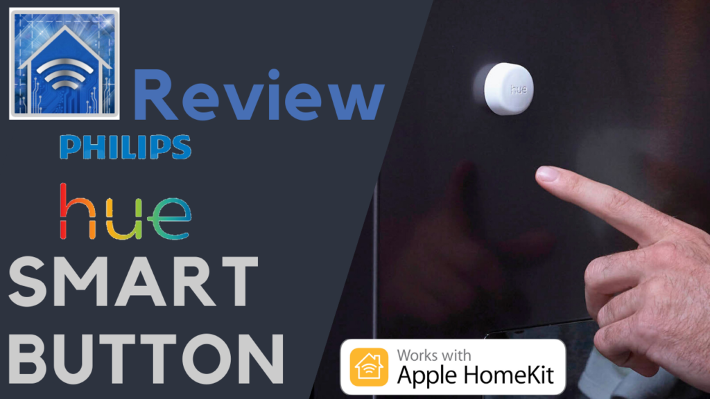
Smart buttons are a crucial part of a functional and practical Apple smart home. Not
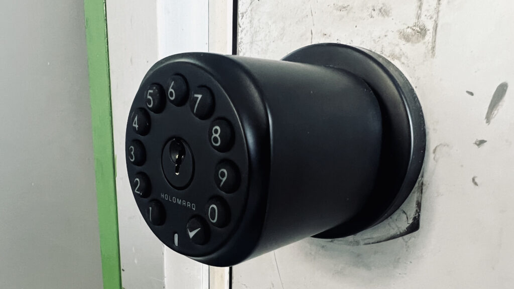
HomeKit door locks are a dime a dozen and most of them have some sort
It’s that time of year again! With deep discounts on thousands of products throughout the online retailer, we’ll definitely see some savings on HomeKit gear during the two-day event. We’ll regularly be updating this post with all the Amazon promotions we can find so be sure to check back are queenly during the sale.
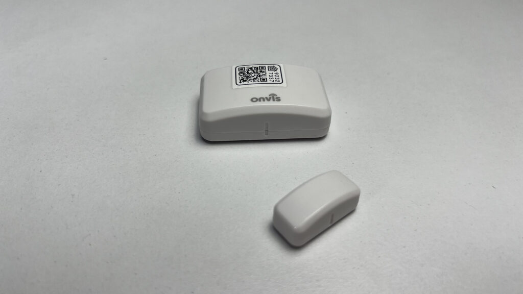
Onvis is fairly well-known for their HomeKit products and they have been hit or miss
One of the downsides of HomeKit is its relatively limited number of product categories. This
Not only can HomeKit air quality sensors help you make sure your family is breathing
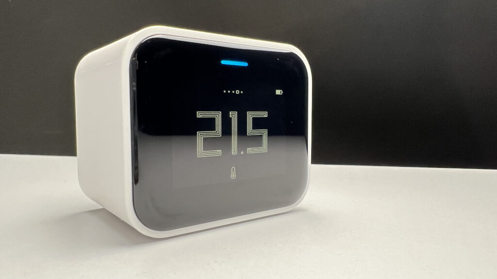
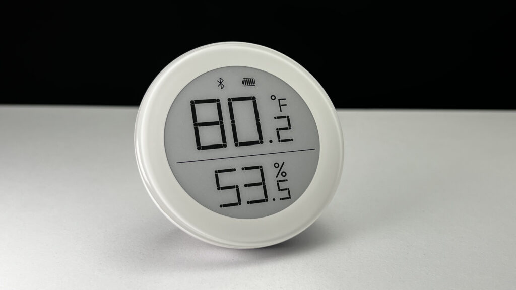
Temperature and humidity Sensors in HomeKit are becoming almost as commonplace as smart plugs these
After a slight Apple Home news dry spell, we get bombarded with news from Aqara, Nanoleaf, SwitchBot and many more. Plus, we weigh in on the Belkin Wemo Matter controversy.
Coinciding with the release of the iPhone 14, Apple has unleashed the latest version of
We don’t really expect smart home talk at Apple’s iPhone event, but there was a
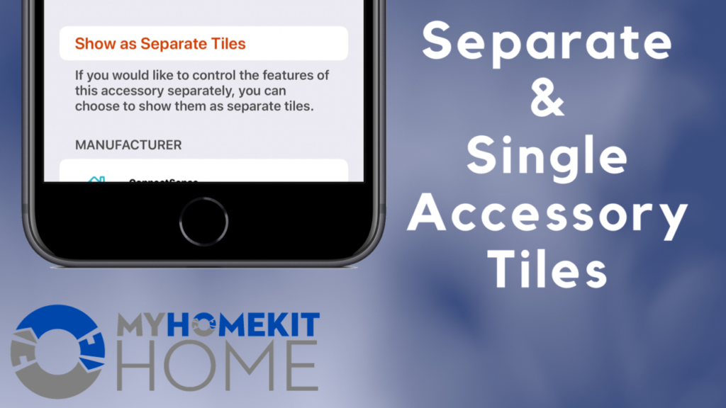
With the introduction of iOS 13 came an extremely controversial change to how accessories are displayed in Apple’s Home app. In an effort to tidy up a bit, HomeKit devices containing more than one accessory were squished together into a single tile adding an unnecessary level of complexity to quickly controlling devices and accessing sensor data. Thankfully, Apple added the ability to ungroup these accessories in iOS 13.2 and here’s how it works.
HomeKit made a huge splash at CES 2020 and this post breaks down many of the biggest announcements.
Regardless of your opinion of the Phillips Hue lighting system, it’s ubiquity and ease of
Nowadays, AI is everywhere, but what can it do in our Apple Home? In this
The original Onvis motion sensor with Bluetooth has been one of the most solid HomeKit
As CES 2024 wraps up, we look at some of the Apple Home and Matter
Smart plugs are probably the category I’ve tested the most and with good reason. They
A smart humidifier is a great addition to your smart home giving you the ability
It’s time to play Apple Home news catch-up once again and, once again, the headlines
Smart curtains are one of those devices that transform your space and take your smart
I’ve kind of been sleeping on Matter because Matter was kind of sleeping on Apple
