At WWDC 2018, Apple launched a new project called Marzipan aimed at making iOS apps more easily adaptable for the Mac. Though this is a multi-year project, Apple kicked it off by bringing a handful of their own previously iOS-only apps to the Mac, including Home. Though much of the same functionality and UI from iOS does make its way to the desktop version, there are a few key differences that we’ll explore today.
Getting Started & What’s Different
Upon launching the Home app on macOS, you’ll be prompted to allow proper permissions. As long as you are signed in with the same Apple ID as in iOS, there shouldn’t be any problems. You’ll also want to enable two-factor authentication and Keychain. Finally, make sure that “Home” is checked under iCloud settings on your Mac. Once all of that is out of the way, we’re presented with a pretty familiar interface, but how we interact with it and what we can do is what changes with this porting of the iOS app.
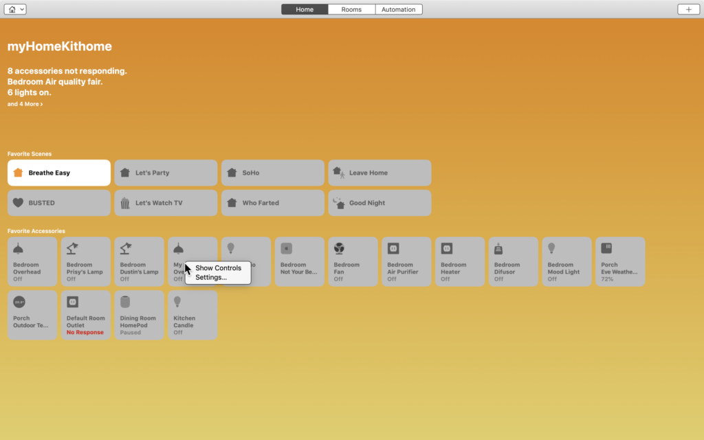
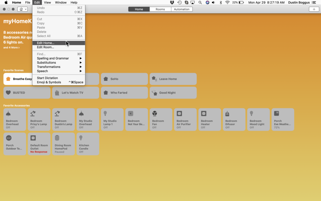
First, we notice that the Home icon at the top left doesn’t take us to our Home’s settings, but rather it takes us to a list of rooms in the current home. To get to your Home’s settings, we select “Edit” from the menu bar and select “Edit Home…” We also notice that clicking the + (plus) button at the top right provides us with options to “Add Automation…” or “Add Scene…”, but not an option for adding accessories as this is not possible to do with the Mojave iteration of the Home app. You’ll also notice that our standard “Home”, “Rooms”, and “Automations” tabs are located at the top rather than the bottom and we can toggle through them by a single click or by using the keyboard command ⌘ (Command) + [1, 2, 3], respectively.
We can toggle the power state of accessories by single clicking on the accessory or to jump into its more granular controls and settings, we can [control] + click or however you have your secondary click configured and “Show Controls” or “Settings…”
Going into the accessory’s settings, we can adjust all of the same configurations as we can in iOS, except that we don’t have links to the manufacturers’ app because it’s not iOS, but we can still see the current firmware version.
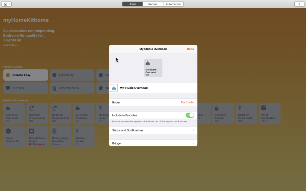
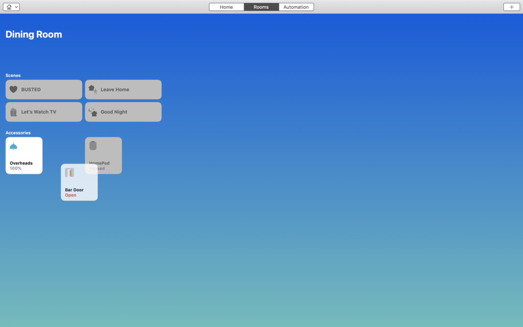
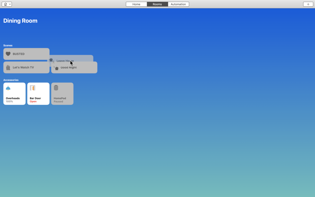
To reorganize accessories in favorites, rooms, or to reorganize scenes, click and hold the desired accessory or scene, and drag it to its new home.
The Good
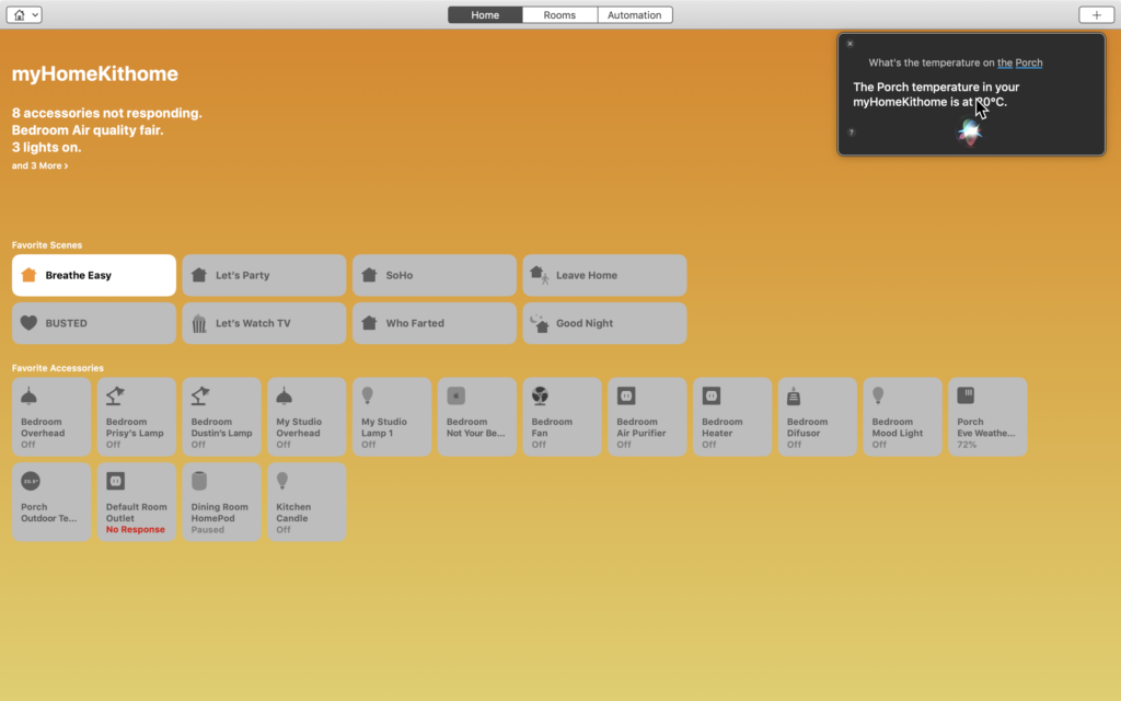
While this wasn’t exactly a feature of the Home app itself, we also saw support for Home control using Siri with macOS Mojave. I gone on about how I don’t use Siri all that much for HomeKit tasks preferring to rely on automations whenever possible, but until Apple releases the HomePod Mini, or Nano, and Siri can comfortably live throughout my home as well, Home commands via Siri on macOS are a great way to not interrupt my workflow to search around for my phone or have to unnaturally lean in or yell when making on-the-fly HomeKit adjustments.
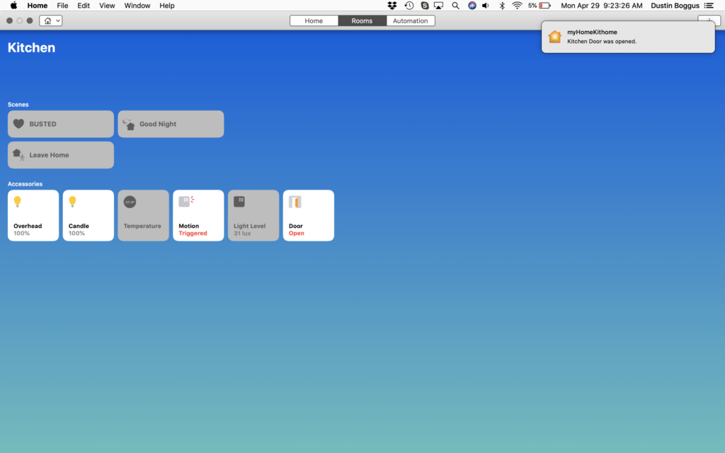
Something I have found myself using and really enjoying are notifications from the Home app. I tend to be largely concentrated and ignore notifications on my phone or iPad when I’m working on something. That is unless the notifications are of the temporary banner type in which I can glance up, see what’s going on and make a decision whether or not to address it. I find this particularly useful on the Mac as this is where I do a large amount of my work and I can continue working with minimal interruptions, yet still be aware of what’s going on in my home and address it if need be.
The Bad
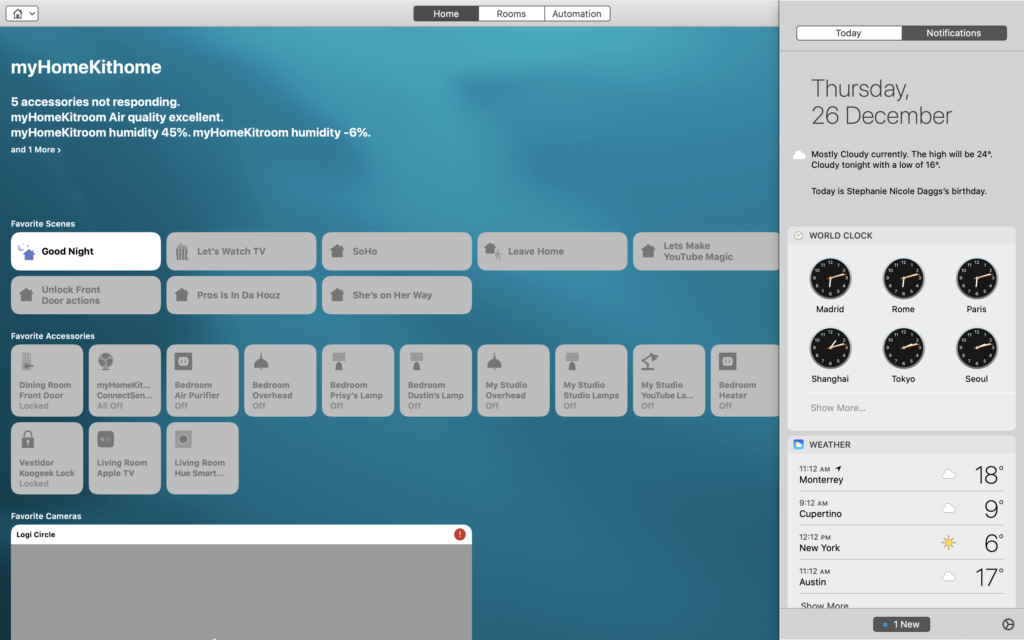
macOS doesn’t have Control Center as we know it on iOS per se, but does have similar controls and widgets built into its Notification Center which are great for a quick calculator app, seeing what’s next on your calendar, or having a quick look at the weather. This functionality is similar to that of the Search screen we get on iOS when swiping right from the home or lock screens. Though through Marzipan its ported Stocks brethren has a widget, Home doesn’t which I find a disappointing as I would find this functionality really quite useful. On a side note, the Search screen is where I believe Home favorites should be instead of Control Center, but that’s for another post.
The most noticeable difference between Home on iOS versus macOS is that we are not able to add accessories to HomeKit using macOS. I’ve contemplated and discussed and I’ve pondered and ranted, but I’ve not for the life of me been able to find a reasonable solution as to why Apple made this decision other than manufacturers’ apps and firmware updates. Since as of yet, I’ve not been able to find any HomeKit manufacturers’ apps for the Mac, I have to assume this is why. However, this theory is flawed based on the fact that we are not required to download the vendor’s app nor are we required to keep our firmware up-to-date for HomeKit. Could Apple have left this feature out simply because they didn’t think people would use it?
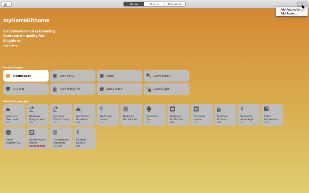
Something I dislike about Home on macOS is how we interact with accessories. On iOS, we long or 3D press on an accessory to access its controls and settings, but on macOS we have to secondary click and then select either controls or options. Given that Force Touch was introduced on MacBooks back in 2015, it just makes more sense to me that we could forego the secondary click and selection process and instead be able to force touch on the accessories and it bring up the accessory’s controls and link to its settings at the bottom. THe same as with iOS.
The Weird
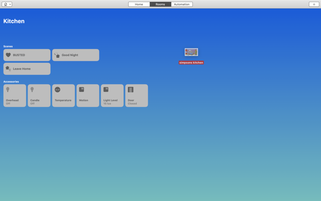
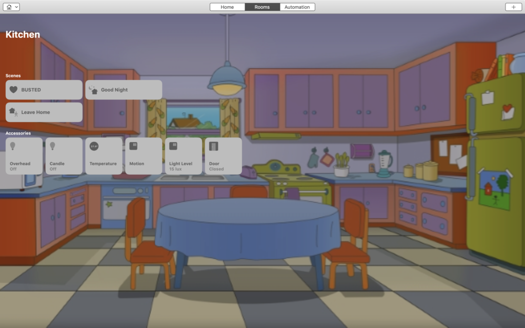
You may or may not have noticed from the above screen shots that the ability to customize background images with photos for the home and rooms has mysteriously vanished. Well, it has and it hasn’t. If you’re a macOS user, you are probably aware at how much of the OS is drag-and-droppable and the same applies to custom background images for the Home app. This is one of those things that really makes sense on Mac, but not so much on iOS.
I touched on this a bit in the first section of this post, but I find it odd that we don’t have an easy access “Edit” button to organize accessories or to adjust room settings directly from the room itself. While I see what they were trying to do here making use of the menu bar, they could have easily placed a button to link to this setting pane directly in the room itself thus, making the app more intuitive and, hence, providing a more user-friendly and seamless experience.
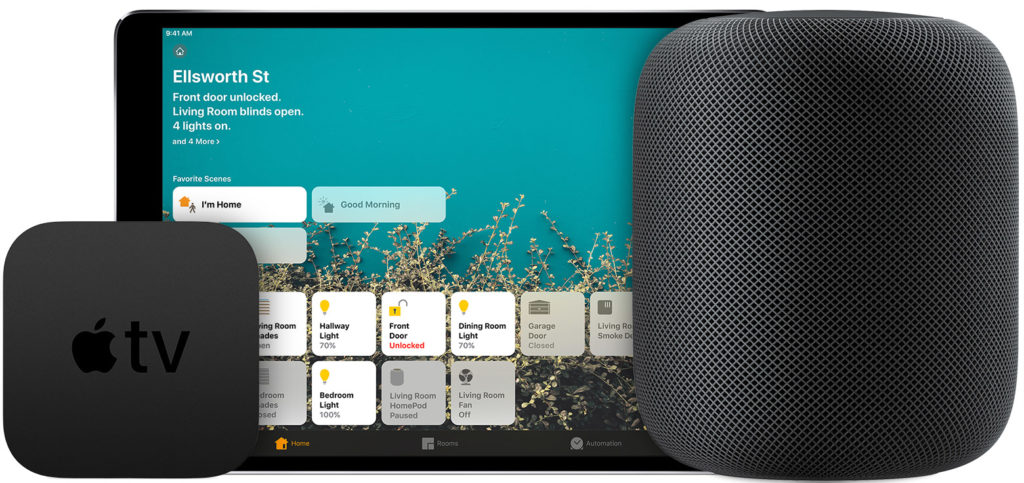
I’ll go into this a little more in my Final Thoughts, but I’m disappointed and confused as to why with the porting of the Home app to macOS that Macs did not become Home hubs. I understand that this wasn’t an update to HomeKit, but simply just a porting of the software, this just makes sense in my mind. Seemingly the requirements for a Home hub is that it has WiFi and Bluetooth radios and that it stays at the home. So then why if an iPad can be a Home hub, why can’t a Mac? While we’re at it, what about iPod Touch? I like the idea of buying up a bunch of used iPod Touch(ae?), placing them in each room of the house, and letting them act as the single “switch” for all the accessories in that room. By the way, wouldn’t this improve Bluetooth signal reliability since theoretically Bluetooth HomeKit accessories communicate with the nearest Home hub?
Final Thoughts
As of the writing of this post, there aren’t really any other apps that address HomeKit specific control for macOS. Different HomeKit-compatible accessories have a smattering of apps, but HomeKit is by and large left up to iOS developers. I don’t think this is necessarily a bad thing though as HomeKit uses our mobile devices to determine where we are in order to run automations, for example. After all, HomeKit is ultimately an iOS framework and the Home app on macOS Mojave is a simple porting. I liken this to apps designed specifically for iPhone that run on an iPad: sure, they work, but it’s not exactly its intended environment. This being said, if it’s going to be on macOS, it might as well add value.
For me, this wasn’t a HomeKit update, this was a macOS update and given that it is part of a bigger project that will allow iOS developers to more easily adapt their apps for macOS, it’s emphasis is naturally not going to be on the app itself, but rather the framework surrounding how the apps transfer between mobile and desktop operating systems. It has long been Apple’s philosophy that people use different devices in different ways and that this should be reflected in the user interface and I agree 100%, but there are definitely some tweaks that the software team could make to this app that could potentially make it more appealing to us HomeKit users.
Do you use the Home app in macOS? What improvements do you think would make it better? The comment section awaits. You can also let us know how you feel on all of our social media @myhomekithome.
We use income-earning affiliate links.
We may receive a small commission on purchases made using links on this page at no extra cost to you.


